
JUST YELLOW
Xilin Ave MRT Station (DT36) – A Strategic Case Study
This is an architecture concept design case study of a Singapore MRT station and how a single-color decision transformed a generic scheme into a coherent identity.
This project began under pressure. The MRT station proposal had been returned by the Land Transport Authority, requesting a new conceptual direction.
The scheme was technically resolved and materially expressive. Yet it lacked identity. Multiple textures. Layered geometries. No hierarchy. Pleasant, but not distinctive. Resolved, yet generic.
It felt like an aesthetic exercise, a design exploring possibilities, waiting for approval rather than asserting direction.
The first creative act was refusal.
Before drawing anything new, I stopped the process and stepped back. That pause created a necessary distance from the existing proposal. It allowed the project to breathe again and opened the possibility for a clearer direction.
Within that moment of suspension, the question became simple:
What is the one decision capable of organizing the whole system?
The client’s brief was explicit:
The station architecture shall be sensitive, bold, and blend with the identity and history of the area.
But boldness under infrastructure constraints is not achieved through addition.
MRT stations in Singapore operate within strict limits: robust materials, controlled budgets, standardised construction systems, and heavy commuter flows. Granite, concrete, and VE metal panels. Performance first. Expression secondary.
My first instinct was to reduce the scheme. Yet minimalism alone cannot solve the complexity of tropical infrastructure. Shelter, ventilation, and durability are non-negotiable.
So instead of reducing the architecture itself, the goal became reducing the noise within it.
The project needed a mediating idea, something capable of connecting the many functional layers of the station into a coherent whole.
During early discussions, I learned that the Xilin district had once been a pineapple plantation. The colour yellow appeared immediately as a possible anchor.
Later, visiting the site, I noticed the large yellow roofs of the Changi Depot dominating the surrounding industrial landscape. Industrial, infrastructural, not public, yet unmistakable.
The colour was already embedded in the territory.
It connected agricultural memory, infrastructural present, and technological future. Xilin is transforming into a technology hub. Yellow carries energy, visibility, and clarity.
At that moment, intuition became certainty.
The concept crystallized around a single decision.
Not yellow as decoration.
Yellow as mediator.
I accepted the standard material palette required by the Land Transport Authority: granite, VE panels, white perforated aluminium, glass, and stainless steel. I did not complain about the limitations of the materials. Instead, I used them with discipline.
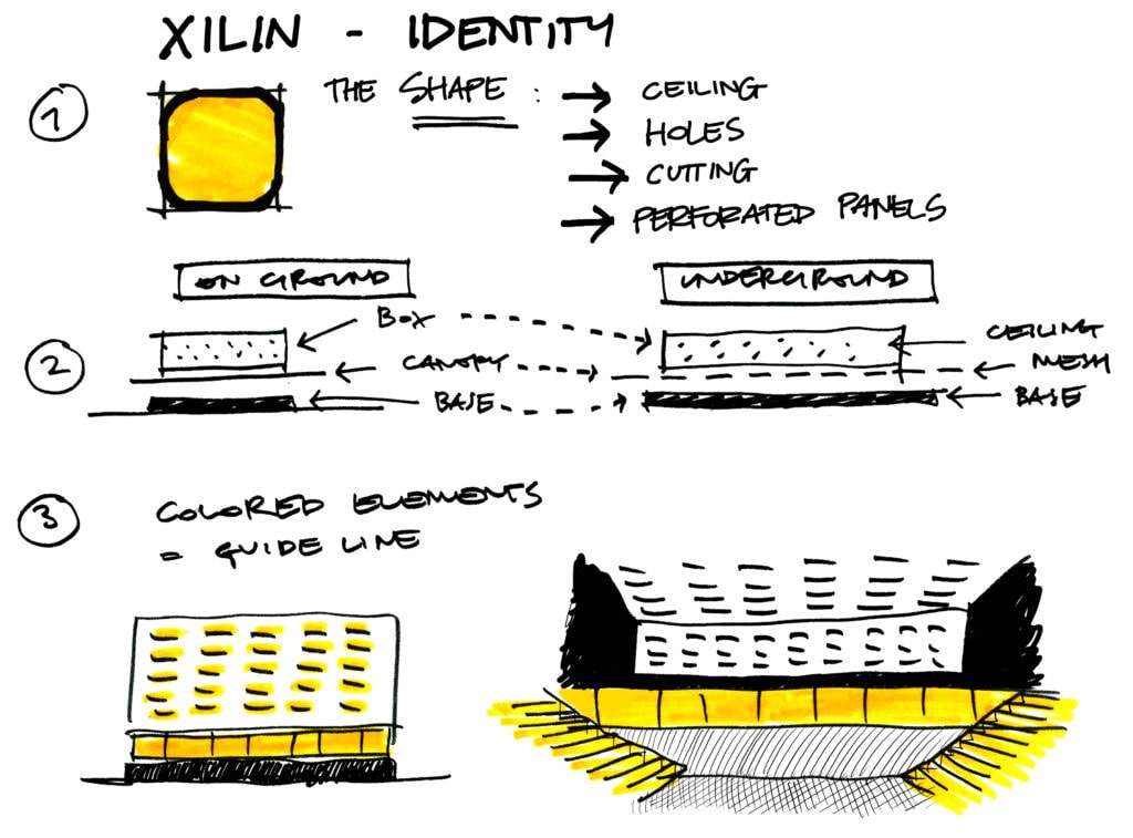
Yellow became the organising device — the fil conducteur connecting entrances, wayfinding, circulation, and architectural identity.
It marks thresholds, guides orientation, and anchors the passenger journey through the station. Geometry becomes clearer. Perforation becomes systemic. What was previously a collection of parts begins to behave as a coherent architectural language.
The colour does not dominate the architecture.
It mediates between its components.
A train station must endure. It must express identity with clarity without becoming rigid, decorative, or excessive.
Conviction required calm reasoning, not drama. For nearly a year, the concept was refined in close collaboration with the Land Transport Authority.
The proposal was accepted and strongly supported.
As construction progressed, the strength of the decision became evident. Despite tight budgets, standardised methods, and material constraints, the built station remains remarkably faithful to its conceptual intent.
THE LESSON
Xilin demonstrates a simple principle.
When an idea is strong, it organizes relationships.
Boldness in architecture does not arise from accumulation.
It arises from commitment.
Scarcity is not the enemy.
Noise is.
Creativity is not the multiplication of forms.
It is the capacity to see new ways to use and combine ordinary materials.
It is the discipline of testing, filtering, and refining.
Designers often lose direction when pursuing complexity. Sometimes the solution is the opposite: pause, step back, and identify the one decision capable of structuring the whole.
In this project, that decision was simple.
Just yellow.